
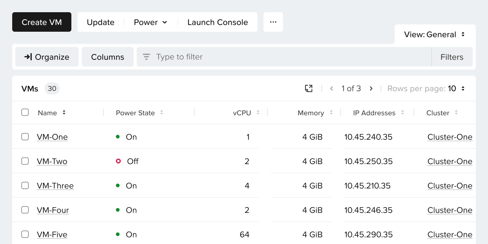
Intro
- Entity Browser is a platform-wide data table page component (actions, filters, table, customization) used across dozens of pages in multiple Nutanix products.
- As design owner, I led the overhaul of how users customize and save list views.
- Unified Favorites and View By into one cohesive Views system to reduce fragmentation and improve discovery.
- Raised usability scores for column customization from 4.6 to 6.8 out of 7.
View By
- Managed column selection and ordering.
- Required multiple steps through dropdowns to create or edit.

Favorites
- Saved filter, Group By, and View By presets together.
- Created and applied through separate filter bar and dropdown flows.

Solution
Through iterative explorations and prototype testing, I reworked the entire experience into a unified model that balances speed, flexibility, and discoverability.
Visual Hierarchy
To eliminate system fragmentation, I unified three distinct customization layers into a single control bar by combining Group By controls with a hierarchical tree view, replacing multi-step modals with a quick-access column popover, and integrating inline filter management directly with saved views.
Interaction & Workflow
An instant column popover with live previews keeps users in context without interrupting their primary task flow.
The redesigned save state applies modifications immediately, giving users the option to save a new view or update an existing one on the fly.
Leveraging localStorage for automatic state persistence ensures temporary adjustments are remembered across sessions without cluttering saved views lists.
Default view

Modified system view

Modified custom view

User Feedback & Validation
Average customization satisfaction rose from 4.6 / 7 up to 6.8 / 7 post-redesign.
Average saving workflow satisfaction jumped from 3.5 / 7 up to 6.7 / 7 across all participants.
Prototype testing revealed that 40% of users were previously unaware table customization even existed in the legacy product.
All participants immediately understood the new Save View As pattern and praised its speed and fluidity.
Key Explorations
I ran two rounds of usability testing (a formative round to test concepts and a final round to validate the refined UI) to evaluate the fundamental trade-off between the legacy model and the new design.
The legacy system offered extreme granularity by keeping Favorites and View By separate, but that flexibility created high cognitive load and visual clutter. The new unified system streamlined these controls into a single flow, sacrificing unnecessary granularity in favor of speed and clarity.
In my initial exploration, I tried applying the new unified interaction behavior while making minimal changes to the existing layout and visual design. However, formative testing proved that updating the logic alone was not enough. The legacy interface remained visually fragmented and scattered, which prevented users from recognizing the simplified workflow.
This insight led me to execute a complete visual overhaul, reorganizing the control bar into a clean, unified layout that fully realized the usability gains.